
Before we start building a website at Wes Web, our web designers are already thinking about how a website’s colors will work together. A brand palette provides a starting point, but it’s still important to check website color contrast to see whether those combinations will be readable.
We’re thinking ahead: What will the buttons look like? Which sections might have dark backgrounds? Can we bring some brand color into the text?
ColourContrast.cc helps us work through those decisions before we build.
Use ColourContrast.cc Right on the Page
The Chrome extension lets us pull up the color contrast checker on a webpage. There’s also the ColourContrast.cc website, which works well in a separate tab or split-screen setup.
We tend to cling to hex codes for no particular reason; they’re just familiar! RGB and HSL work just as well too if that’s your forte, and the eyedroppers make sampling colors convenient.
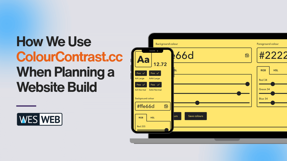
The tool previews the combination and shows AA and AAA results for normal and large text. Those distinctions matter, so we check the result that applies to the text we’re planning. Where we can aim for AAA contrast, we do. These WCAG color contrast checks are one part of building WCAG-compliant websites.
Start With the Buttons and Check Our Assumptions
Buttons are usually one of the first things we consider. We might need one style or a secondary option that stands out against a different background. We usually try not to go past two button styles because then things start to get a little chaotic.
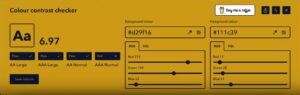
For each button, we check the background color against the foreground: the text. And sometimes those combinations really surprise us. We’ll look at something and think, “This is definitely going to pass,” and it just doesn’t. That’s why we double-check buttons and link color contrast, among others.
White text on a button can be especially tempting because it’s an easy choice, but sometimes black, dark gray, or navy is what actually provides the contrast we need. Building accessible websites leaves plenty of room for creativity. Some decisions, though, come down to what works best for the user and making things readable.
Colour Contrast Checker Helps Us Think Beyond Black and White
Our web designers sometimes choose to add more texture and interest through simple parts of a website, like headings and body text. We don’t always want straight black or white text. Below, you’ll see a light blue we chose to pair with navy for one of our website builds. Testing those pairings within a brand palette for contrast first helps us decide which colors to emphasize throughout the site.

Plain links need attention, too. We might choose one link color for light backgrounds and another for dark backgrounds. Sometimes one works for both, but we always check.
If we’re developing the palette, the RGB sliders let us explore a slight adjustment before finalizing a color. We’re more cautious when working with an established brand’s defined colors.
There’s plenty of room for creativity in web design, but some decisions come down to what works best for the user. Checking color contrast accessibility early for multiple different situations where different colors are used helps us bring both into the design.
Play With Colors and See Changes in Real Time
We also like to play with the colors in a document or on a live webpage, keeping the contrast checker alongside it. Change a background, try a different text color, check the combination, and adjust again.
Seeing the colors in context helps. A pairing might look promising in the checker, but putting it into an actual heading, button, or section helps us decide exactly how we want to use it and pair accessibility with a brand.

Let’s Plan Your Website’s Colors With Accessibility In Mind
Have brand colors but aren’t sure how they’ll work on a website? Get in touch with Wes Web. Let’s talk through a design that feels like your business and is WCAG-compliant so it’s easier for your visitors to read.